We design the screens first — wireframes, flows, mockups — then hand off clean Figma files your developers can actually work from. No guesswork once development starts.

A lot of clients think UI/UX just means "make it look good." But good design is also structure, clarity, usability, and making sure developers can build it properly without guesswork. It's that — but it's also figuring out what goes where, how people move through screens, and making sure developers aren't left guessing.
Before we open Figma, we want to know who's actually going to use this. What are they trying to do? Where do they get stuck on your current product? We ask questions first — design comes after.
Wireframes are just boxes and labels — no colours, no fonts, no distractions. We use them to agree on what goes where before anyone gets attached to how it looks. It saves a lot of confusion — and expensive redesign work later.
Once the structure is agreed on, we do the actual visual design in Figma — colours, typography, spacing, components. Everything gets documented so the design stays consistent whether it's screen 3 or screen 30.
We make the Figma prototype clickable so you can actually try it — tap through screens, see transitions, check if the flow makes sense. Much easier to spot problems here than after it's been built.
The Figma file we hand over isn't just a design — it's organised by screen, labelled properly, with spacing noted and assets already exported. Developers shouldn't have to guess font sizes, spacing, or hunt for the right assets..
Four clear stages — each one ends with something you can review before we move forward. You're not waiting until the end to see what you're getting.

We spend the first few days just asking questions — about your users, your competitors, what's not working right now. A lot of the clarity comes from these early conversations before any design work starts.
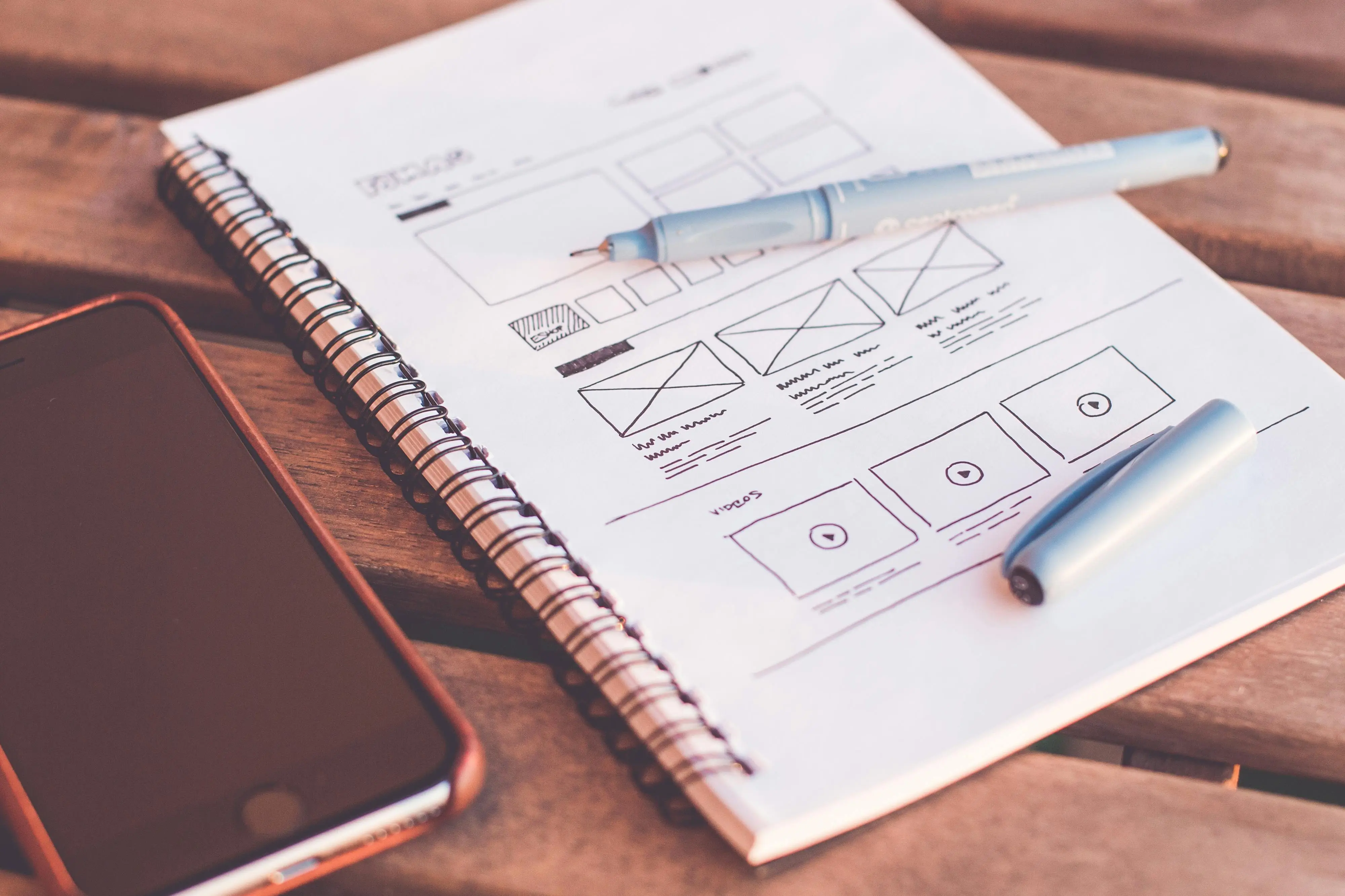
Wireframes look rough on purpose. We're not worried about colours yet — just whether the layout makes sense and whether users can get from A to B without getting confused. Fixing this here is free. Fixing it after dev is not.

This is the actual visual design — what your users will see. We work in Figma, build out every screen, and set up a proper component library so future updates don't feel disconnected from the original product., it matches the rest without starting from scratch.

When we hand over the Figma file, your developer should be able to open it and start building — without needing constant clarification from us, no guessing at spacing or colours. Everything is labelled, assets are exported, and we're still available if questions come up during development.
We could list a bunch of things here. But the honest answer is — most clients come back because we're straightforward, we communicate properly, and the files we hand over are actually usable.
We design for the people who'll actually use it — not for what looks impressive in a case study. That means asking questions before opening Figma, and testing before calling it done.
Most UI/UX work from us ships in 1–2 weeks. If something's going to take longer, we tell you before the deadline — not on the day it was due.
We don't charge per revision round. If something doesn't feel right, say so — we'd rather fix it properly than hand over something you're not happy with.
We usually start with the mobile version first — because that's where most people will see your product. Desktop comes after. Most of your users are on their phones — the design should reflect that from the start, not as an afterthought.
We share progress regularly — not just when there's something big to show. If you haven't heard from us in a few days, something's wrong. That's just not how we work.
The Figma file we send over is the last thing between design and development. We make sure it's clean, labelled, and export-ready — so your developer isn't stuck guessing spacing, assets, or component behaviour.
Figma for design, FigJam for planning, Notion for docs — and the development stack that helps turn those designs into working products.










Honest answers — no marketing speak.
Something we didn't cover?
Talk to usUX is about making sure people can use the product without getting confused. UI is the visual layer — colours, typography, spacing, buttons, all the things users interact with on screen. We usually work on both together, because one without the other doesn't work very well.
Depends on the scope. A single landing page takes 3–5 days. A full app or multi-page website is usually 2–4 weeks. We'll give you a realistic timeline after the first call — and if something changes, you'll hear it from us early.
Mainly Figma — it's what most developers expect, and sharing files with clients is straightforward. For user research and flow mapping we use FigJam, and for visual assets we use Adobe Illustrator and Photoshop where needed.
Yes. The Figma file, exported assets, icon sets — all of it is yours once the project is done. We don't hold files back or lock you into anything.
We don't count revision rounds. If something's not right, we fix it. In practice, because we check in with you at each stage, big surprise revisions at the end are rare.
Yes, always. We start on a 375px mobile screen — not a desktop. Once that's right, we scale up. You'll get designs for mobile, tablet, and desktop as standard.
Yes — we set up the Figma file so a developer can open it and start building without needing to call us. Layers are named, spacing is noted, assets are exported. We're still available if questions come up during development.
Both. Some clients only need UI/UX design in Figma, while others ask us to handle development as well. We can work with your existing developers or build the project ourselves.
Yes. A lot of our UI/UX work starts with redesigning products that already exist but feel outdated, confusing, or difficult to use.